
DATA ALERT: The Safety Gap in New York City Streets (2025–2026)
Why This Story is Trending Now
Public concern about New York City’s street safety has surged to its highest level in two decades. According to Google Trends, searches for “NYC crime” and “NYC safety” spiked ten‑fold in mid‑2025 and have remained at this elevated level ever since. SafeAreasNYC.com is the first independent response to this unprecedented public demand for granular, honest, street‑level data.
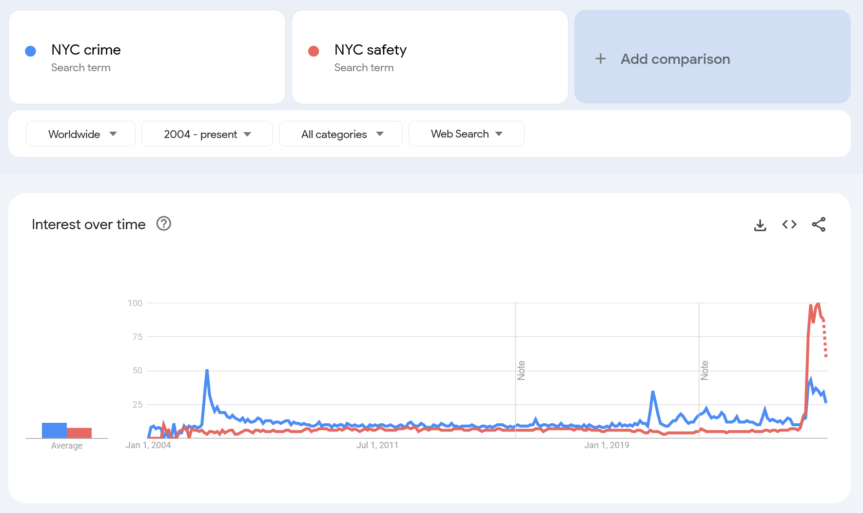
Google Trends Chart 2004–2026: The 10× spike in safety concerns
Why this matters to residents and visitors:
People need clear answers to practical questions — how safe is a specific area where they live or plan to live, how far they must walk to public transport, and how two locations compare. Official police maps rarely allow this: data is either aggregated too broadly, presented in a way that distorts risk, or lacks the tools needed for meaningful comparison. SafeAreas solves this by showing location‑based street‑level risk in a format ordinary users can understand.
The Investigation: Why Official Police Maps Mislead the Public
Official crime maps produced by NYPD and NYC OTI are built for administrative record‑keeping — not for the person choosing a hotel, an apartment, or simply walking home at night. This creates a significant “Utility Gap” between what the public needs and what official tools provide.
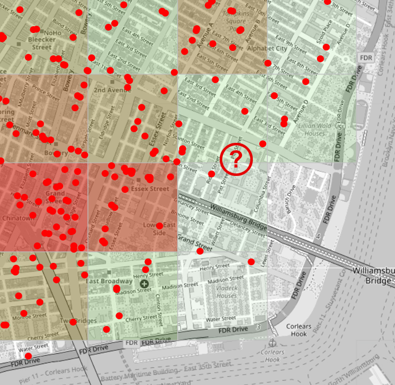
SafeAreasNYC applies a professional 500×500‑meter spatial grid across the entire city, using a full year of NYPD incident data (2025). By weighting crimes by severity and normalizing by land area, the map reveals the city’s “hidden geography” — the persistent patterns that monthly snapshots fail to show.
Comparison 1 — NYC crime: NYPD vs. NYC OTI vs. SafeAreasNYC “Grid Intensity”
Comparison of three NYC Criminal maps:
New York City Police Department
VS. NYC Office of Technology and Innovation
VS. the SafeAreasNYC.com Crime Map
1. How incident points are displayed
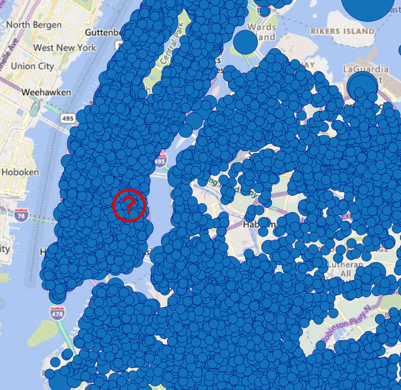
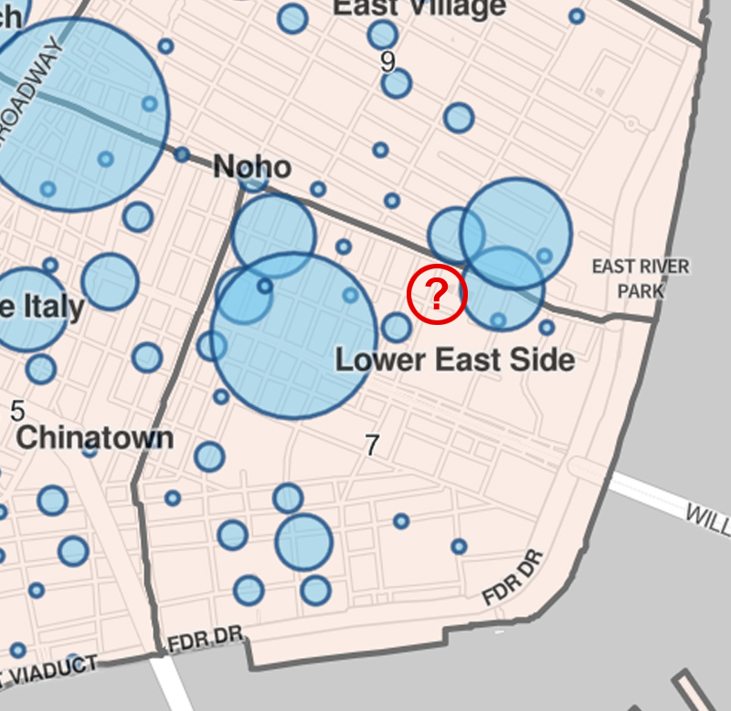
NYC OTI and NYPD both show individual crime incidents but immediately cluster them.
– OTI clusters only when incidents occur at the exact same spot.
– NYPD clusters based on proximity, even when incidents are not geographically identical.
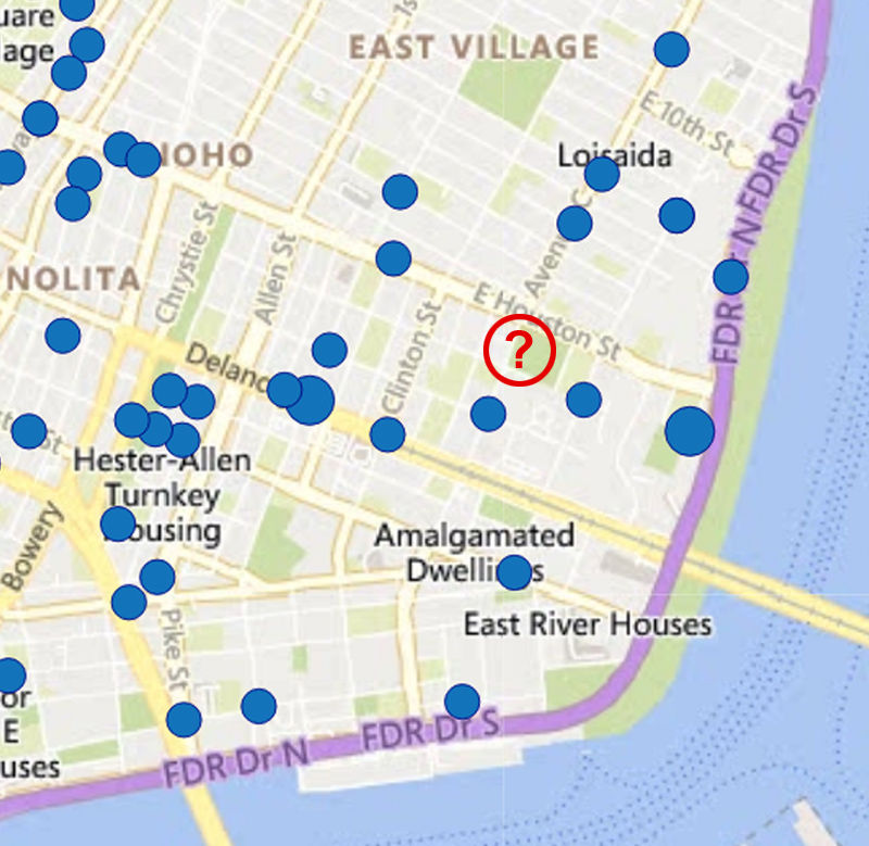
SafeAreasNYC shows every incident as its own point, without clustering. To avoid overlap, each point receives a small random offset of up to 20 meters.
Why this matters:
Cluster bubbles scale with the number of incidents but occupy geographic space. This visually exaggerates the size of the affected area and gives users a misleading sense that crime “covers” a much larger zone than it actually does. In short: clustering crime incidents is a poor UX choice that distorts public understanding.
2. Data aggregation for evaluating safety on a small area (e.g., choosing a place to live)
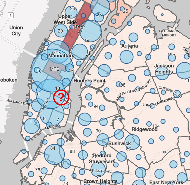
Comparison 2 — Robbery‑only: NYPD vs. NYC OTI vs. SafeAreasNYC
NYC OTI:
No spatial aggregation at all — users cannot get a numeric, location‑specific crime estimate.
NYPD:
Provides two problematic layers:
– Blue clustering circles that look like geographic zones but are not — and become misleading when interpreted as such.
– Crimes per 1,000 Residents by Precinct, which introduces major distortions:
• Central Park appears as one of the “most dangerous” areas simply because no one lives there.
• Densely populated precincts look artificially safer, even when the pedestrian‑level risk is identical.
• All crime types are weighted equally — meaning 100 pickpocketings and 100 violent assaults produce the same index .
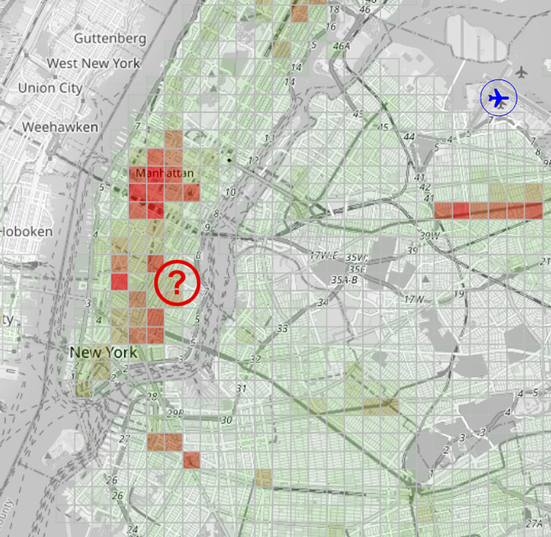
SafeAreasNYC:
• Uses equal‑area grid cells.
• Weights crimes by severity.
• Normalizes by land area — producing a realistic, location‑based measure of street‑level risk.
When we calculate our Crime Level indicator, we don’t think in terms of administrative statistics — we think in terms of real‑world probability and the severity of consequences for a person who might encounter crime on that street.
Expert Commentary: From the Founder
Anthony Nick, an independent analytics expert with 25 years of experience in real estate and travel data — and whose early tools anticipated Google Analytics’ “User Flow” by four years — offers a unique perspective on urban safety analytics.
How the Idea Originated
The roots of SafeAreas trace back to Anthony’s first trip to New York in 2012. While choosing a hotel — and aware of the city’s reputation for street crime — he searched for a clear, data‑driven way to understand neighborhood safety. He found an NYPD incident‑point map and a heatmap of housing prices, and immediately noticed a strong correlation between them.
But there was no user‑friendly crime heatmap. More than a decade later, when he revisited the idea, such maps still didn’t exist — not for New York, nor for London, Paris, or Berlin. That persistent gap became the foundation of SafeAreas: a project built to reveal the hyperlocal safety patterns of the world’s major cities.
“Official maps show a snapshot; we show the DNA. A monthly report is like judging a climate by one rainy day. By stripping away seasonal noise and focusing on a year‑long grid, we uncover the persistent patterns that define a street’s character. For a tourist or a renter, this ‘Digital Compass’ is no longer a luxury — it’s a basic requirement for personal safety.”
Ready‑to‑Publish Story Angles
1. Why official crime maps fail users — even when they publish street‑level data London and New York do publish incident‑level crime data. The problem is not secrecy — it’s usability. Clustering, monthly noise, lack of spatial aggregation, equal weighting of all crime types, and poor UI/UX make it nearly impossible for ordinary people to compare two locations or understand real‑world risk. SafeAreas uses the same raw data but applies proper normalization, severity weighting, and a clear grid‑based map that reveals what official tools hide through design limitations, not intention.
2. The Hidden Geography of Risk: Crime intensity in Manhattan varies by up to 300% between adjacent 500‑meter blocks, revealing structural blind spots in precinct‑level reporting and challenging long‑standing assumptions about “safe” neighborhoods. (The New York Times)
3. The Safety Premium Recalculated: Several high‑value Manhattan districts — including areas with luxury retail and major corporate offices — show elevated incident intensity that contradicts their market reputation, raising questions for investors, insurers and relocation planners. (The Wall Street Journal)
4. Data vs. Perception: SafeAreasNYC’s severity‑weighted grid exposes persistent robbery corridors and micro‑hotspots that remain invisible on official cluster maps, highlighting the limitations of legacy crime‑mapping tools used by city agencies.(Bloomberg)
5. Two Blocks, Two Different Cities: In several Manhattan districts, two hotels or apartment buildings separated by a single avenue exist in radically different safety realities — a hyperlocal divide that shapes daily life far more than precinct‑level statistics suggest. (New York Magazine)
6. The Danger Next Door: Our map shows robbery‑intensity spikes on streets that appear “perfectly safe” on NYPD’s cluster maps — a stark warning for families, commuters and anyone relying on official tools.(The New York Post)
Media Assets & Contact
We provide journalists with high‑resolution heatmaps, custom data exports for specific neighborhoods, and expert commentary on spatial crime distribution.
Attribution: “SafeAreasNYC.com — independent analysis of NYPD crime data (Local Crime Level Index, 500×500m grid).”
![]()
Anthony Nick, contact: емаil
Anthony Nick is an Independent Analytics Expert with over 25 years of experience in architecting complex digital systems for the Real Estate and Travel sectors. A veteran entrepreneur since 2002 (founding VividWay LLC in San Diego, CA), Anthony has a long history of out-innovating industry giants. His proprietary analytical tools "User Trails" pre-dated "User Flow" features in Google Analytics by four years. In recent years, Anthony has operated as an independent consultant, advising businesses on high-stakes data architecture and growth. "Safe Areas" Project is the culmination of this expertise—applying professional-grade spatial analysis to improve public safety for everyone.